


Five Mistakes Still Being Made By Websites in 2010
Here are 5 mistakes websites still make in 2010 - I call them mistakes because they just get in the way of the visitor.Talking like a brochure
Talking as if you're the CEO of some international conglomerate when in fact you're simply a one-man-band selling t-shirts makes you sound ridiculous. In fact, these CEOs sound ridiculous anyway. No one cares about your mission statement, or your corporate philosophy, or your obscure synonyms. Give people the information they're looking for : what you do (what you sell), your prices, customer benefits, reassurances. Useful information related to what you do/sell is great too e.g. if you sell gazebos, "how to" articles and case studies on how gazebos are used will work well.Copying the competition
The trouble with copying the competition is that you're deliberately making yourself indistinguishable from the competition. It's also a bad habit to form - because if the competition AREN'T doing "it", you probably think "it" won't work. And so you stay within the guidelines of what the competition are, or aren't, doing. You're following the conventions of your market.Hiding contact information
Having to hunt for a phone number is a nuisance. Not finding one at all is suspicious. Putting your contact information in your "header" area shows you are real and ready to be spoken to.Forcing shoppers to register
This still happens in 2010. You buy your goods, click "buy now", and are confronted with this deadweight page:-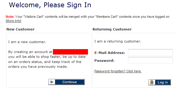
This is like a bouncer suddenly turning up between you and the cash register, asking you for ID. It's been well established for years now (and since 2004 for shoptemplate / puresilva) that shoppers don't need to register to buy stuff. And they can still get to track orders and have all the benefits of "registered users".
Clutter
A site that has 87 categories, ads everywhere, or just a messy layout where the home page has competing calls to action. The visitor is overwhelmed with messages. You can have a lot of information on your site, but try to have just one "call to action" per page.Believing in magic (bonus mistake)
Ok, a 6th one - not so obvious as it's to do with how website owners think - you won't find this on their pages. Basically, there's a belief amongst some that selling online escapes all the miserable rules of selling offline i.e. the necessity of hard work and endeavour. Instead, magic happens online whereby good rankings in search engines occur naturally and very quickly (hours / days after launch), and sales follow.Share this article:
view my profile on Google+