
 beat the competition


 posted in
 Puresilva Template Now With Responsive, Mobile-Friendly Design
With the growth in mobile (specifically, small screen) website traffic, website developers are having their hand forced into ensuring their websites are friendly to such small-screen visitors. Mobile visitors have different needs to desktop users. You can indulge desktop visitors a lot more with aesthetics and graphical layouts - they have the screen real-estate to accommodate all of this. Not so with mobile users - everything is much more condensed. The focus is sharpened down to the "gist" of each page - strip away all that's extraneous - and that even includes much of the visible navigation your "normal" desktop site shows - into collapsed dropdown menus.It's been a long time in development, but we are pleased to announce part 1 of our commitment to helping small-screen users with mobile-friendly, responsive pages for our product listings, product detail and basket pages:-
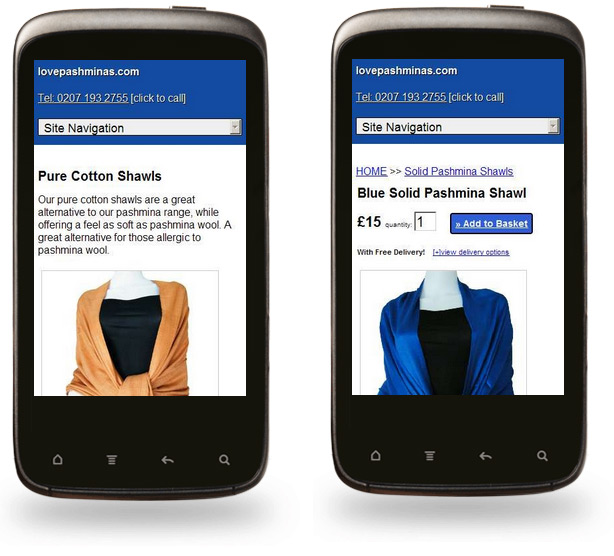
We're working on converting the entire template to become mobile-friendly over the next few weeks.
All of our customer's sites using our template that track updates (which is 98% of them) will adopt all of these updates for free, just like any other update we apply. Consider that companies are offering services to make your site mobile-friendly for costs of £1000+ and you realise the benefits of a templated system - you can have developers working week in, week out on your site for absolutely no cost to you.
Share this article:
view my profile on Google+