


Visited and non-visited links should be different colours
It's a good idea to colour-code the links on your website so your visitors know which links they've already clicked on. This might sound like the most obvious thing in the world, but it's a usability guide that many web designers eschew on their own websites (let alone mere mortals).
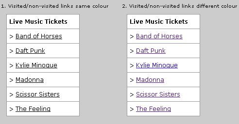
People often have a 'scatter-gun' approach to searching for specific information on a website, and don't always keep track of which links they've clicked on. Colour-coding visited and non-visited links tells users exactly where they've already browsed and makes a complete search of a website much easier. Not only that but people who regularly visit a particular website can see immediately any new pages added to the site - see above example where it could be that Kylie Minogue tickets have just been added to a website. In figure 1, this is not obvious, but in figure 2, a repeat visitor can see this is a new page that's been added - just by the colour of the link.
The main reason why people don't colour-code their links is probably to do with aesthetics and bad habits (maybe some people think CSS stands for Common Sense Sucks?). While it's true that blue underlined links gain the most clicks, you can make your visited and non-visited links any colour you like if you have a specific colour scheme in mind - as long as its obvious to your visitors which links have been visited and which have not.
Share this article:
view my profile on Google+